
Cappuccino, Espresso or Latte anyone?
According to Gimko Coffee UK people in the UK drink 70 million cups of coffee per day, compared to 165 million cups of tea. The average British male coffee drinker, consumes 13 cups per week, while the average female drinks up to 11 cups.
However which way you take yours, if you’re a coffee lover like most of our staff you will hopefully enjoy browsing through our round up of some great coffee packaging to get your creative design juices going.
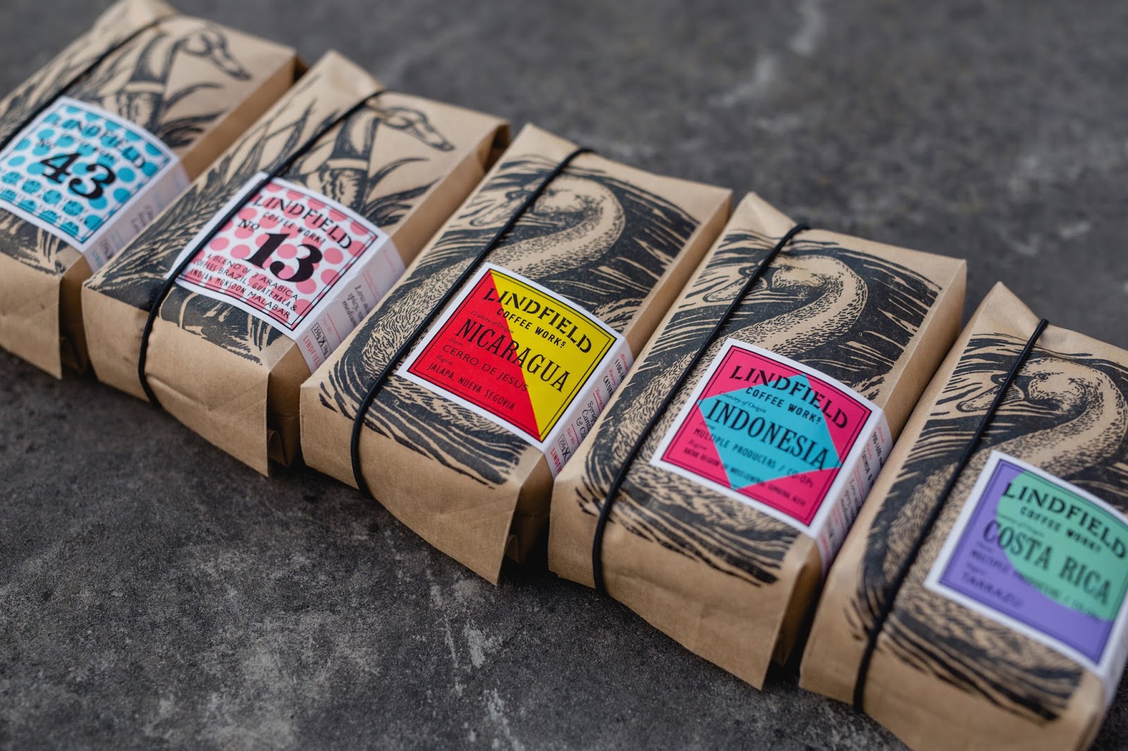
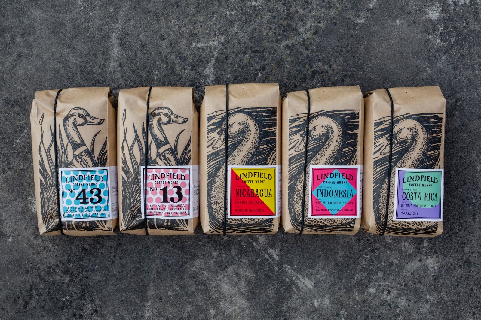
1. Linfield Coffee – Designed by Studio Parr Creative Agency
Linfield Coffee Works is an independent roastery and coffee bar based in Sussex village. Studio Parr were asked to create a new look for the packaging that reflected the surroundings and artisan process. We love the mix of modern and traditional design in the packaging for this coffee.
“We wanted the branding and packaging to feel like a true representation of the village, and what better way than to hero beautiful linocut illustrations of the local characters, individually stamped onto each bag of hand-roasted coffee” – Will Parr, Creative Director
Each coffee origin has its own vibrant modern label that creates a good contrast with the traditional illustrations. Worth a visit if you live in the area, as the new site not only offers a coffee bar but the roasting operation is also in full view. They also stock coffee equipment for you to master in your own home and offer great advice on the different brewing methods.

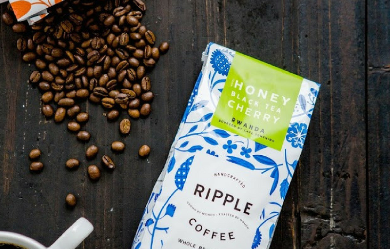
2. Ripple Coffee – Designed by the Design Womb Agency
The bright packaging and intriguing flavours of Ripple coffee caught our eye. All the coffee beans are sourced from women-owned farms and a percentage of every sale goes back into these communities.
Design Womb was the agency that created a complete brand identity and creative package design for this coffee brand. The base coffee bags were printed in four different colours and paired with specific flavour labels that also alter in colour. This design allows for extending the range with the use of these bases and alternative labels for any future roasts.
The packaging is fun, fresh and captures the spirit of the company while reflecting inspiration from coffee farms around the world.


3. Paradise Gourmet Coffee Club – Designed by the Artemov Artel Design Studio
This luxury coffee packaging made our heads turn with its striking black and gold design. Sergii Artemov, was tasked to create a packaging design for a series of exotic coffees that reflected a premium and exclusive product.
The coffee is only produced in certain areas in parts of Hawaii, Indonesia, Ecuador, Jamaica, Nepal and Yemen. The origins inspired Sergii to create vivid images of mystical characters relating to the cultures. The graphics, shape and embossing create the image of a luxury product, which is only heightened by the gift box collection being packaged in a wooden box.


4. Wishbone Brew – Design by Also Known As (AKA)
This conceptual packaging design was the team at AKA’s solution to a challenge to re-imagine the traditional approach to packaging coffee.
We love the shape and colours they have used to bring about this modern design. The juxtaposition of the soft colour palette and elegant font against the harshness of the metal makes this design stand out for us.
“A quick sanding, prime, and dip in paint helps add some individuality among the products and re-enforces the handmade nature of the product, No two wishbones being exactly the same” AKA


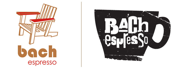
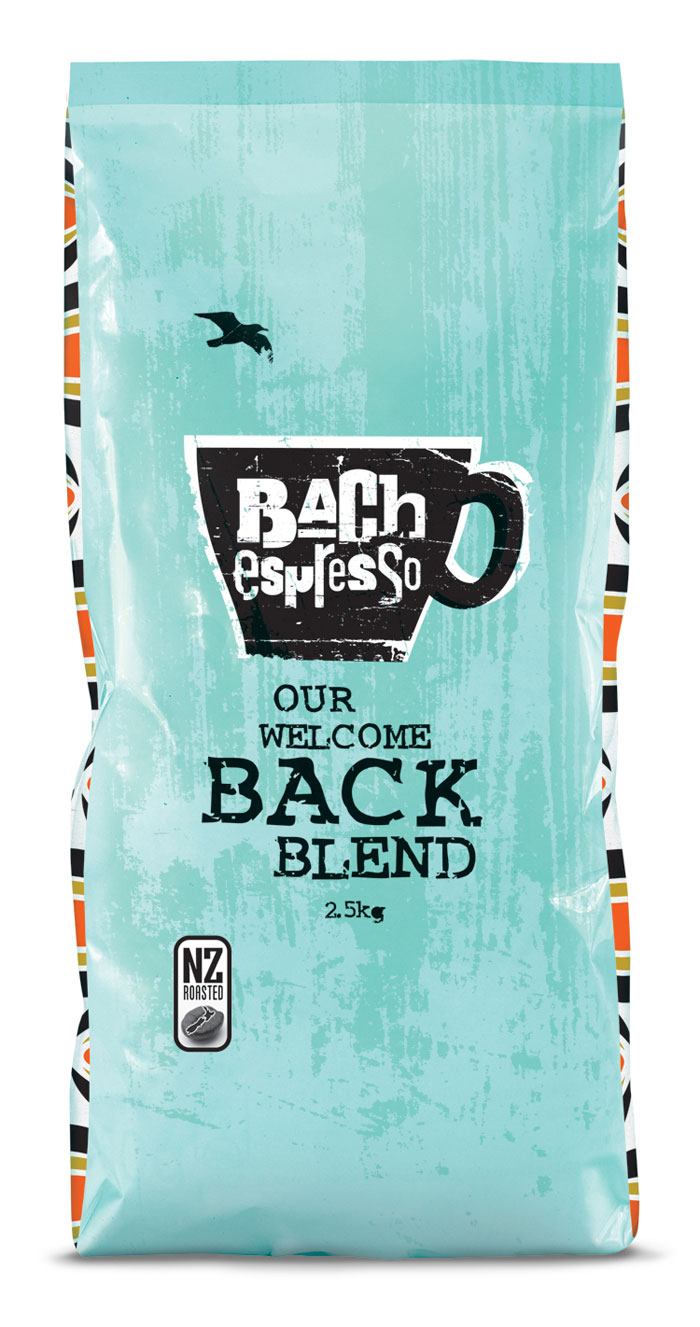
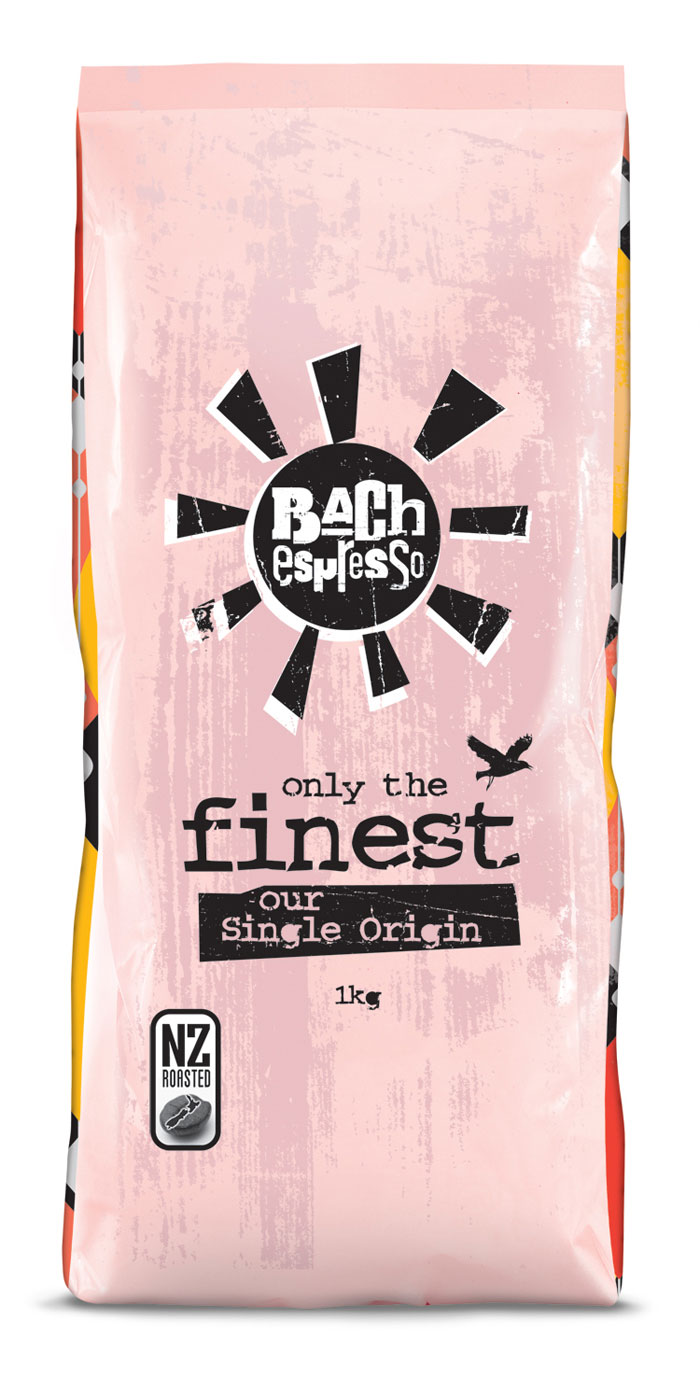
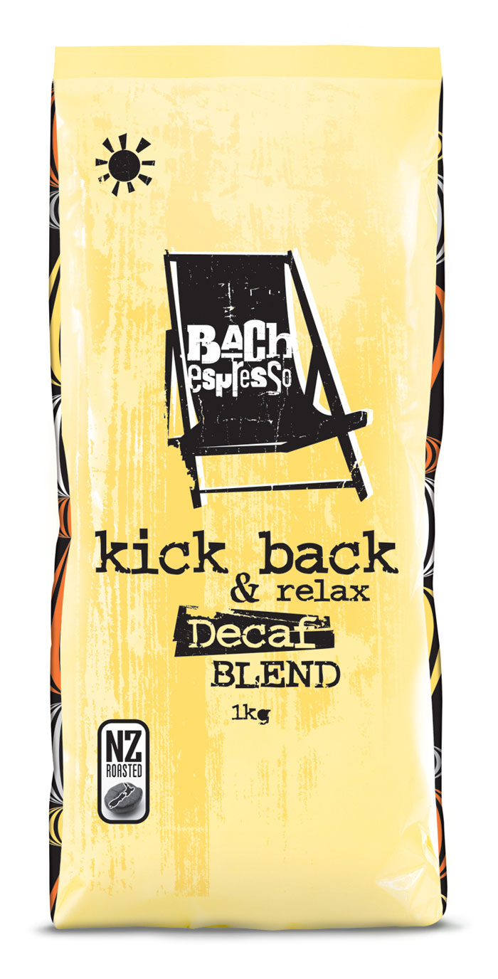
5. BACH espresso – Designed by Coats Design
Bach (pronounced ‘batch’) Espresso is a retail Cafe brand based in New Zealand. A Bach is the name given to a small holiday home or beach house in New Zealand.
Coats were given the challenge to refresh the brand from their coffee bags through to the staff uniforms and cafe fixtures! Coats incorporated the use of the relaxed Kiwi holiday scene into their designs, by using the inspiration from the 1950’s retro summer bach.
“With such an evocative Kiwi name, the brand was generic. We recreated its story, and gave it a personality to stand out in a highly competitive sector. Various key ideas and items became flexible brand icons, with pastel colours and retro patterns, textured and weathered typography adding to the rustic charm, forming the core essence of the brand.” Coats Design
We love the feeling of nostalgia this packaging creates for its customers.
Hope you enjoyed reading the post, we are off to put the kettle on!