
Have you ever wondered why some coloured packaging seem to leap off the shelves, while others blend into the background? It’s not just a stroke of luck; it’s a calculated science of colours.
Now, let’s unlock the meaning of colours in packaging.
Red: The passionate powerhouse
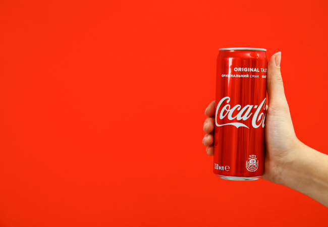
Imagine opening a box wrapped in fiery red – it screams excitement. Red is associated with energy, passion, and urgency. It’s no wonder brands like Coca-Cola choose red for their packaging, creating an instant connection with their consumers.
Orange: The zesty zing
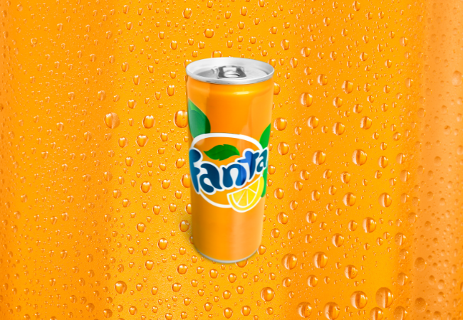
Orange radiates enthusiasm and cheerfulness. It’s often seen in food packaging, such as Fanta, as it stimulates appetite and portrays a sense of fun. A snack packed in orange instantly becomes a treat for the eyes.
Yellow: The sunny optimism
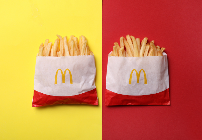
Yellow is the colour of optimism and cheerfulness. Brands like McDonald’s use it to create a sense of happiness. It’s a colour that makes you smile and feel at ease.
Green: The symbol of health and nature
Green is the colour of life itself. It’s all about nature, health, and freshness. Companies like Whole Foods use green to convey organic goodness. And who could forget Burt’s Bees’ lush and green packaging that promises natural skincare? Mother Nature would be proud!
Blue: The trusty hue
Blue is the colour of trust and reliability. That’s why tech companies and financial services, such as IBM and LinkedIn, choose it as it shows confidence. When you unbox a gadget in blue packaging, you immediately feel it’s dependable.
Purple: The regal elegance
Purple is associated with luxury and sophistication. It adds a touch of elegance to any product. Think about receiving a gift in royal purple – it’s like unwrapping a treasure. Brands like Cadbury’s have mastered the art of using purple to create a sense of indulgence.
Pink: The playful charm
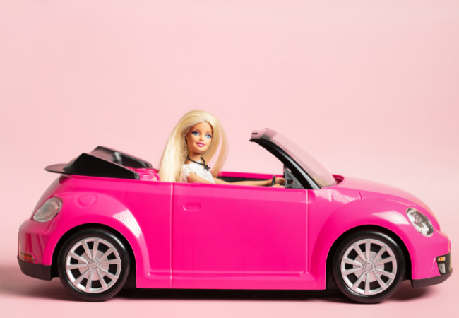
Pink is all about sweetness and playfulness. It’s a favourite for beauty and confectionery brands. Barbie and Victoria’s Secret know how to tap into this vibrant colour. Pink packaging invites you to indulge in something delightful.
Black: The timeless classic
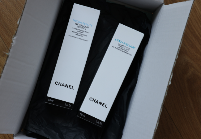
Black oozes elegance and timelessness. That’s why it’s a favourite in high-end fashion and luxury items for brands such as Chanel and Prada. It whispers, “We’re not just selling a product; we’re selling an experience.”
White: The clean canvas
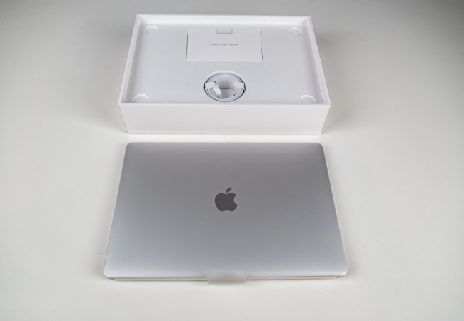
White signifies purity and simplicity. It’s often used for minimalist and high-tech products such as Apple. White packaging makes your product look sleek and modern.
Grey: The balance of neutrality

Grey is a neutral colour that balances between black and white. Companies like Apple (again!) and BMW use grey to keep things sleek and modern. It’s versatile and can convey a sense of sophistication or neutrality, depending on how it’s used.
Brown: an earthy delight
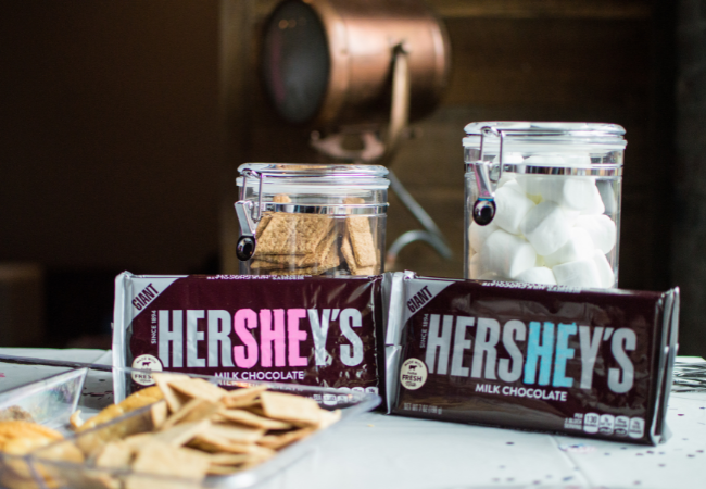
Brown, often associated with warmth, reliability, and rustic comfort, is like a cosy hug from a beloved old sweater. Brands like UPS and Hershey’s have embraced brown to convey a sense of trustworthiness and the familiar joy of chocolate.
Now that we know what these colours mean, remember, it’s not just about choosing one color. Packaging often combines these hues to evoke different emotions. Think about the blue and yellow combo of IKEA, which says, “We’re trustworthy and affordable.”
So, the next time you’re choosing coloured packaging for your products, think beyond the aesthetics. Consider the psychology behind the colours you pick. It’s more than just a pretty package; it’s a statement, a feeling, and a connection waiting to be made.
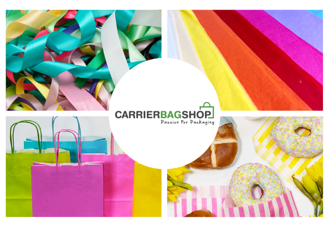
At Carrier Bag Shop, we offer a delightful range of coloured packaging including coloured kraft rolls, coloured twisted-handle paper bags, coloured tissue paper and coloured ribbons to help businesses make a lasting impression.
Happy packaging!