
Every four years, the world comes together to witness the pinnacle of athletic achievement—the Olympic Games. But beyond the awe-inspiring feats of strength, speed, and skill, there’s another aspect of the Olympics that quietly but powerfully influences our daily lives: the colours.
The power of the Olympic colours
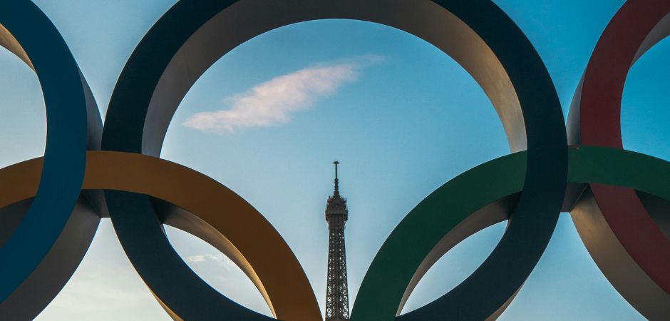
The Olympic colours are represented by the five interlocking rings, each with its own colour: blue, yellow, black, green, and red. These colours, along with the white background, were chosen for their significance and symbolism:
Blue: Represents Europe.
Yellow: Represents Asia.
Black: Represents Africa.
Green: Represents Australia (Oceania).
Red: Represents the Americas (both North and South America).
White Background: Symbolises peace and unity.
The combination of these colours were intended to ensure that every national flag in the world included at least one of these colours, symbolising universality and the coming together of athletes from around the globe. These colours, along with the unique palette of each host city, set the tone for branding and marketing during the Games.
Branding opportunities and challenges
For companies, the Olympics present a unique branding opportunity. Aligning with the Games can enhance a brand’s image, making it appear more dynamic, inclusive, and globally aware. However, this opportunity comes with challenges. Brands need to integrate Olympic colours into their packaging in a way that feels authentic and resonant with their existing identity. The key is to strike a balance between leveraging the excitement of the Games and maintaining brand consistency.
Case Studies: The Olympic influence on packaging
Let’s look at some specific examples of how the Olympic palette has influenced packaging colours:
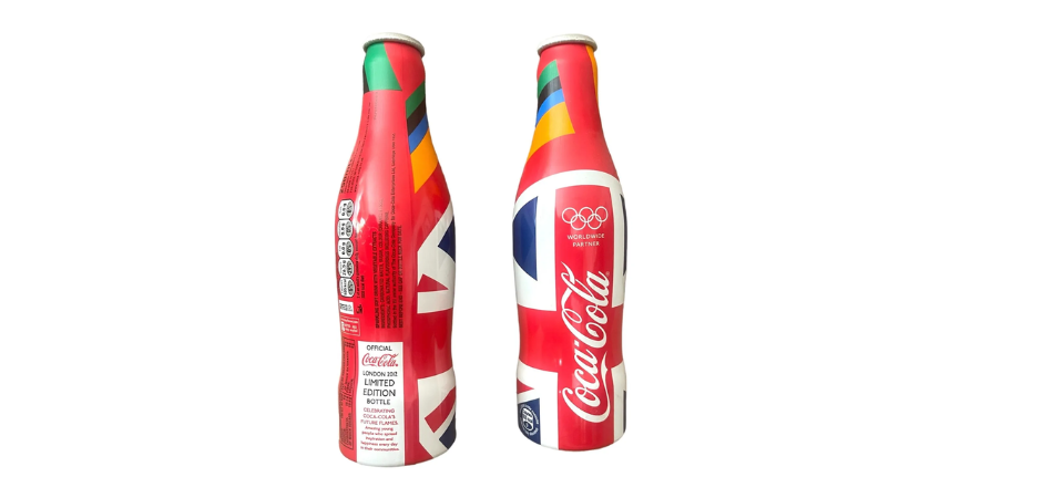
1. Coca-Cola
As a long-time sponsor of the Olympics, Coca-Cola often incorporates the host nation’s colours and themes into its packaging. For the London 2012 Olympics, Coca-Cola introduced special edition bottles featuring the Union Jack’s red, white, and blue, combined with the Olympic rings. This not only celebrated the host city but also reinforced Coca-Cola’s commitment to the global spirit of the Games.
2. P&G (Procter & Gamble)
P&G, through its “Thank You, Mom” campaign, has skillfully used Olympic colours in its packaging. During the Rio 2016 Olympics, P&G products featured vibrant green and yellow hues, reflecting the Brazilian flag. This approach not only honored the host country but also created a visually appealing connection between the product and the festive spirit of the Games.
3. McDonald’s
McDonald’s often tailors its packaging to reflect the Olympics. During the Beijing 2008 Olympics, the fast-food giant used red and yellow—the colours of the Chinese flag—across its packaging, menus, and promotional materials. This strategy helped McDonald’s connect with local consumers while promoting the excitement of the global event.
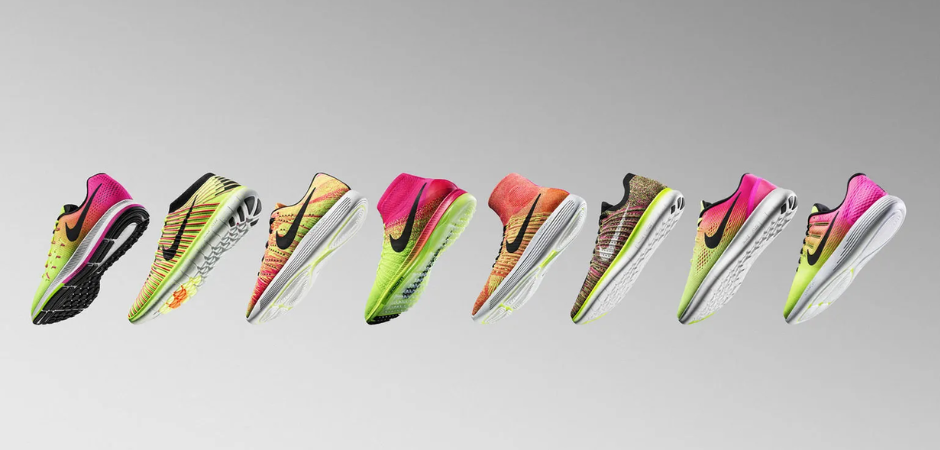
4. Nike
Known for its innovative sportswear, Nike often creates special edition gear for the Olympics. For the Rio 2016 Olympics, Nike’s apparel and footwear featured bright greens and yellows, reflecting the vibrant Brazilian landscape and flag. These designs not only celebrated the host country but also stood out in the marketplace, appealing to both athletes and consumers.
5. Samsung
As a worldwide Olympic partner, Samsung often incorporates Olympic colours and themes into its product packaging and promotional materials. For the Tokyo 2020 Olympics, Samsung released special edition Galaxy smartphones and accessories featuring Japan’s national colours of red and white, alongside the Olympic rings. This not only highlighted the host nation but also underscored Samsung’s innovative spirit in line with the Olympic values.
Beyond the games: lasting impact on design trends
The influence of Olympic colours extends beyond the duration of the Games. The palettes and design trends introduced often leave a lasting impact on global branding and packaging. The innovative use of colours, patterns, and themes seen during the Olympics can inspire new design trends in various industries, from fashion to technology. Companies that successfully integrate these trends into their products can benefit from the fresh and contemporary appeal that resonates with consumers.
Conclusion
The Olympic Games are a testament to human achievement and a celebration of global unity. The colours associated with the Olympics are not just aesthetic choices; they are powerful symbols that resonate with people around the world. By thoughtfully incorporating the Olympic palette into packaging, brands can create a sense of excitement, connection, and relevance. As we look forward to future Games, it will be fascinating to see how the evolving Olympic colours continue to influence the world of packaging and design.
Related Articles