
When it comes to packaging design, typography is often overlooked. However, it can be a powerful tool for communicating with consumers and making your product stand out.
What is typography?
Typography is the art and technique of arranging type. It encompasses everything from the choice of font to the size and spacing of the letters. When used effectively, typography can:
- Grab attention: Well-designed typography can be eye-catching and help your product stand out on the shelf.
- Convey information: Typography can be used to communicate important information about your product, such as the name, ingredients, and nutritional facts. Well-designed typography makes it easier for consumers to read the information on the packaging.
- Create a mood or feeling: The right typography can create a certain mood or feeling around your product, such as luxury, excitement, or simplicity.
- Build brand identity: Typography can be used to create a consistent brand identity across all your marketing materials, from packaging to website design. It can help your brand be more memorable and recognisable.
- Increased sales: Studies have shown that packaging with effective typography can lead to increased sales.
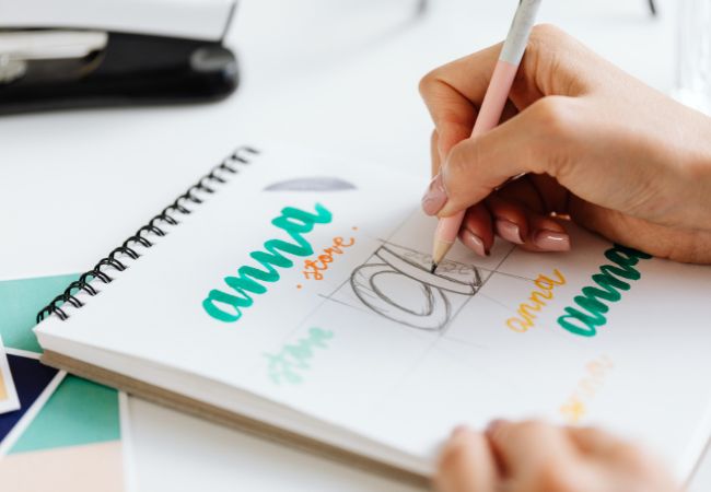
How to choose the right typography for your packaging
Here are a few things to keep in mind when choosing typography for your packaging:
- The target audience: Who are you trying to reach with your product? The typography you choose should be appropriate for your target audience.
- The product category: The type of product you’re selling will also affect your chosen typography. For example, a luxury product might call for a more sophisticated font, while a playful product might be better suited to a more casual font.
- The overall design: The typography should work well with the overall design of the packaging. It should be easy to read and should not compete with the other visual elements.
- Consider the purpose: The purpose of the text should also be considered when choosing fonts. For example, you might want to use a more formal font for a legal document and a more casual font for a blog post.
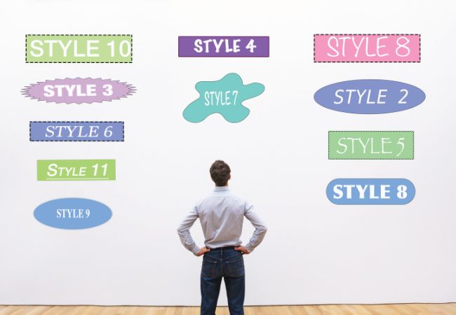
Examples of typography
Here are examples of typography that go well together.
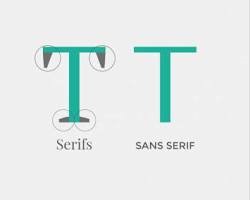
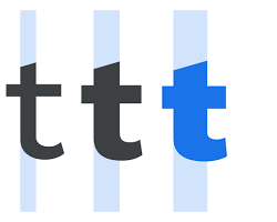
- Serif and sans serif: Serif fonts have small decorative strokes at the ends of the letters, while sans serif fonts do not. These two types of fonts can be paired to create a classic and elegant look. For example, you could use a serif font for the brand name and a sans serif font for the body copy.
- Contrasting styles: You can also pair fonts with different styles, such as a traditional serif font with a modern sans serif font. This can create a more visually interesting and dynamic look.
- Similar weights: When pairing fonts, it’s important to consider the weight of the fonts. The weight refers to the thickness of the letters. It’s best to pair fonts that are of similar weight, as this will create a more balanced look.
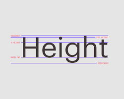
- Similar x-height: The x-height is the height of the lowercase letter “x”. When pairing fonts, it’s also a good idea to choose fonts with a similar x-height. This will help the text to flow more smoothly and be easier to read.
Here are some specific font pairings that work well together:
- Helvetica Neue and Garamond: This is a classic pairing that’s often used in branding and packaging. Helvetica Neue is a sans-serif font that is clean and modern, while Garamond is a serif font that is elegant and sophisticated.
- Lato and Montserrat: This is a modern pairing that’s often used in web design. Lato is a sans-serif font that is versatile and adaptable, while Montserrat is a geometric sans-serif font that is bold and eye-catching.
- Roboto and Raleway: This is a versatile pairing that can be used for various purposes. Roboto is a sans-serif font that is easy to read, while Raleway is a sans-serif font that is stylish and contemporary.
- Source Sans Pro and Source Serif Pro: This is a superfamily pairing that comes from the same family of fonts. It means that the fonts share some similarities, such as the same x-height and stroke weight. This makes them a good choice for creating a cohesive and unified look.
How to use typography effectively
Here are a few tips for using typography effectively in packaging design:
- Use a limited number of fonts: Too many fonts can be overwhelming and confusing. Choose a few fonts that work well together and use them throughout the packaging.
- Consider the size and spacing of the letters: The size and spacing of the letters should be appropriate for the type of information you’re communicating. For example, the name of the product should be larger than the ingredients list.
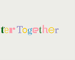
- Use colour: Colour can be used to add emphasis to certain parts of the packaging. For example, you could use a bold colour for the brand name or a softer colour for the nutritional facts.
- Be consistent: The typography should be consistent throughout the packaging. This will help create a cohesive and professional look.
So, if you’re looking to create packaging that will stand out from the competition and communicate your brand message effectively, don’t overlook the power of typography.
Ready to start branding products with your typography?
Carrier Bag Shop offers a wide range of printing services, including custom printed carrier bags. We can help you bring out your typography in your packaging and create a design that will help you stand out from the competition. Contact us today to learn more about our printing services.