Wine Packaging Designs
According to the WSTA (Wine and Spirit Trade Association) the UK is becoming a nation of Wine drinkers.
“Wine drinking is no longer just for connoisseurs, with new polling commissioned by the WSTA showing it is now the favoured alcoholic drink for 60% of UK adults, compared to all other alcohol products. The UK wine industry, which includes a growing number of vineyards, is one of the most influential and diverse in the world. It is worth £17.3bn in economic activity to the British economy, supports nearly 270,000 jobs and contributes £8.6bn to the public finances annually.”
With that in mind, we decide to look as some wine packaging to give us some design inspiration…..so go and grab a glass, put your feet up and read along.
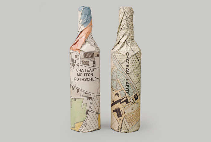
1 Waddeson Wine Rothchilds Collection – Designed by Paul Belford.
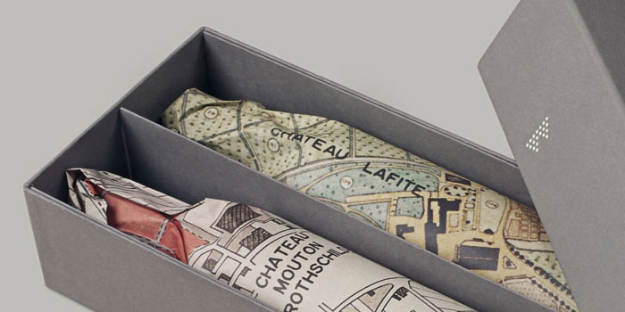
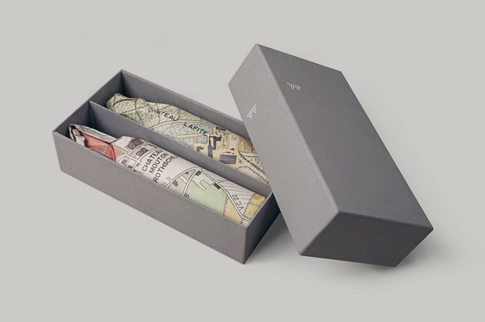
We love London designer, Paul Belford’s cool packaging of the Rothchilds’s collection of wines for the distributor Waddeson Wines. Using the idea of featuring these 1870’s maps of the respective vineyards as a wrap for the bottles makes for a beautiful looking bottle of wine.
The simple grey box adds to the elegance of these bottles, with a simple “W” symbol. The “W” logo for Waddeson is made up of a series of dots to resemble two bunch of grapes.
“The identity is designed to balance the rich tradition associated with Rothschild wines with a more modern approach to the wine business.” Paul Belford Ltd
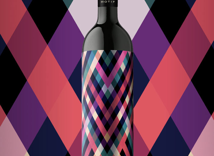
2 Motif Wine – Designed by En Garde
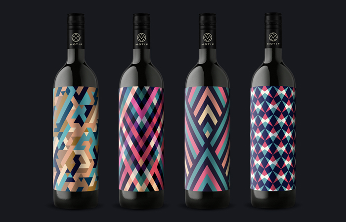
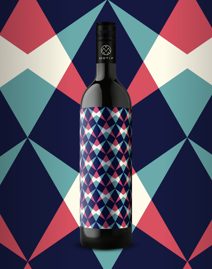
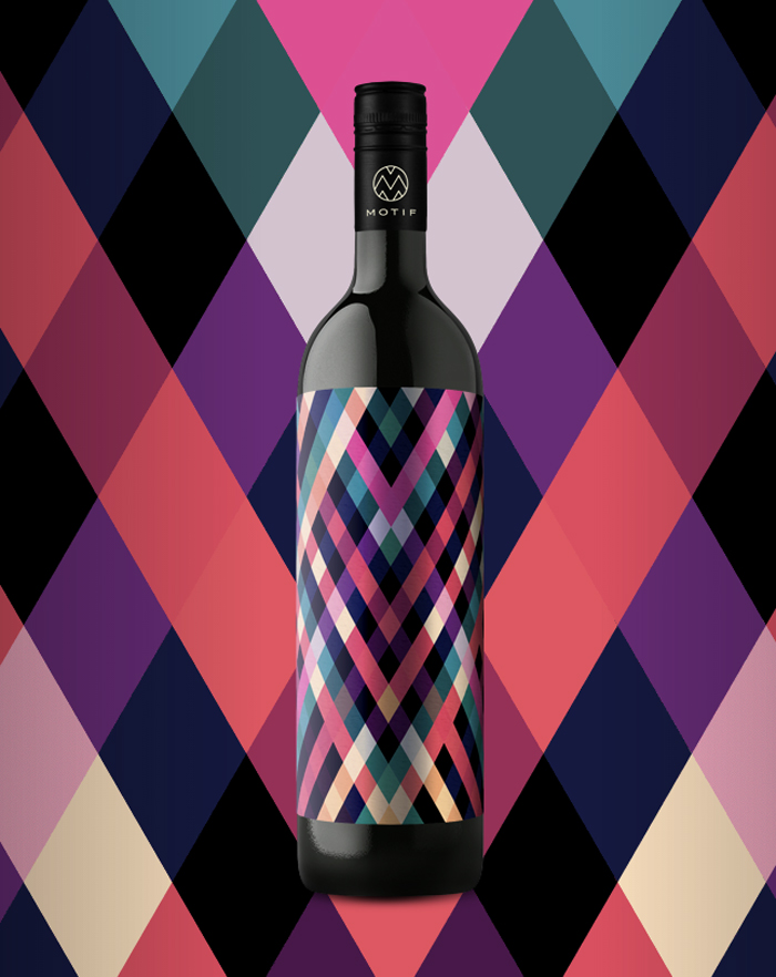
It’s hard to miss the bold packaging of these Motif Wine bottles even if you tried! We love the geometric patterns and striking colour schemes that En Garde have used for this range of wine labels. Each type of variety has been given a different pattern rather than a traditional written label.
The Motif website states: “We believe the time is ripe for a wine with few words. We will no longer dictate what we see, taste and smell. This is why we have Motif, which can only be explained by a word in our Southern Styrian dialect. And a pattern of color and form. A label, a word, a wine: you will understand our Motif in the glass.”
They almost look too good to open, definitely one to display on the bar cart!
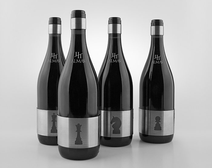
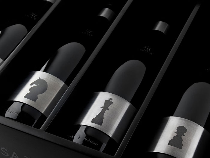
3 Almas – Designed by Sergio Daniel Garcia
4. Siete Pasos (Seven Steps) – Designed by Calcco
Calcco were tasked with a project to bring together wines from different origins under the label of Seven Steps. We love the use of personality traits that define each type of wine for example “El Prenda” (The Shady one), “El Figura” (The Leader), “El Importante” (The Important one) and “La Lianta” (The Troublemaker) are to name but a few.
The modern illustrations reflect the personality associated with each wine type providing a fun and cheeky design.


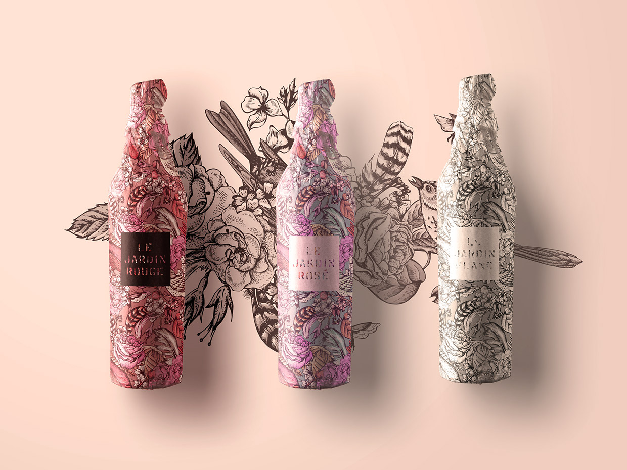
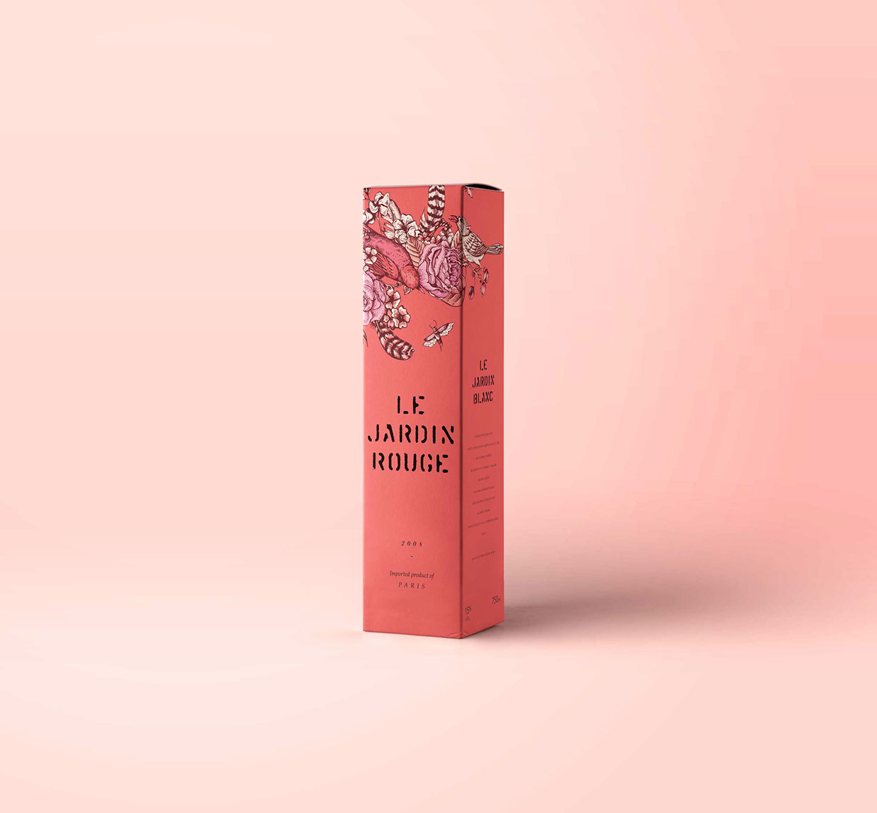
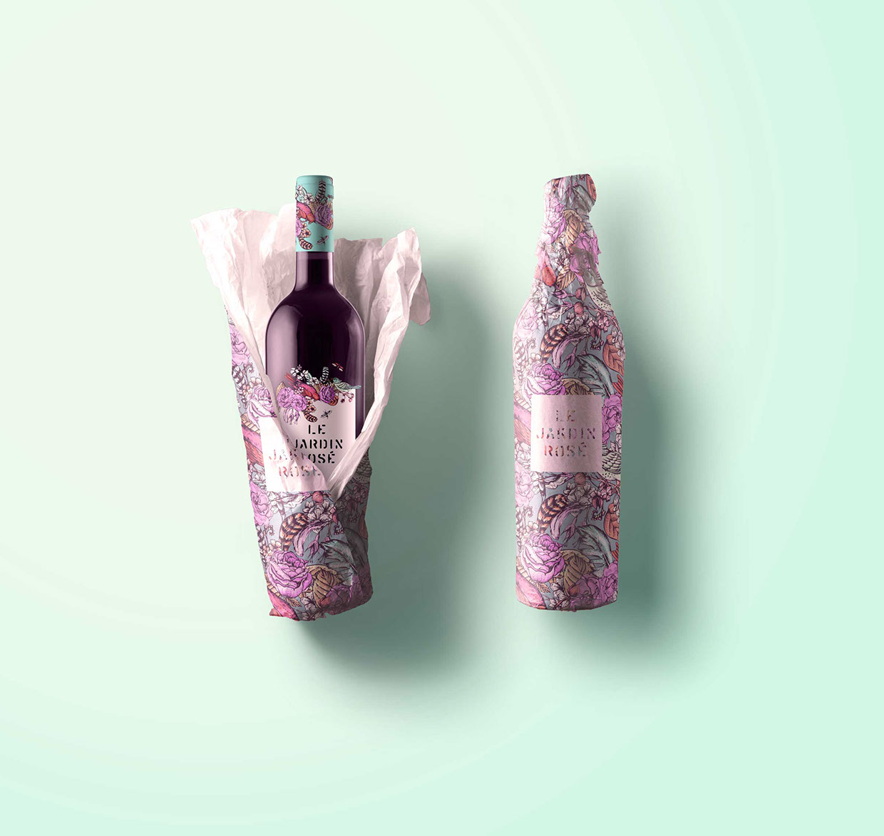
5. Le Jardin Wine – Designed by Sarah Gwan
How pretty is this concept wine brand and packaging design by Sarah Gwan. The tattoo style design looks really effective and the colour palette reflects the colours from a summer garden (Jardin).
