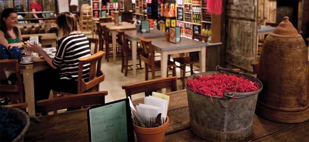
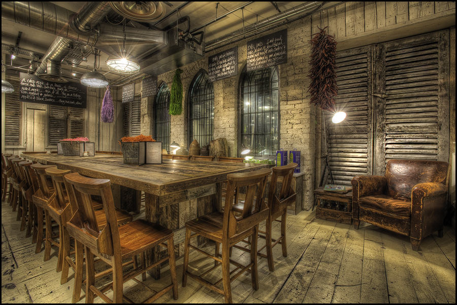
Despite being an ever growing healthy food chain, Bill’s Restaurants use industry leading design to maintain a unique feel across all their locations. With warm colours and a well crafted wall-to-wall ambience, this award-winning eatery can be summed up in three simple words; local fresh flavours.
Bill’s designed their packaging in conjunction with McAra Office Supplies, an agency client of Rocaba Packaging. We caught up with both Bill’s founder and Head of Design, Bill Collinson, and McAra Office Supplies Managing Director, Jane McAra, to reveal their strategy around how such a powerful design philosophy was able to extend into packaging and beyond.
Rocaba Blog (RB): Bill, before you even looked at packaging, what were your design goals, and how did that ultimately influence the packaging?
Bill Collinson (BC): I tried to blend both modern and classic styles, and so every design aspect has to have a story to tell. I feel like I’m painting a picture every day. I like to mix things up whereby you might see something from your past, but then also something quite quirky, and so the packaging has to bring back the warmness of yesteryear.
RB: Designing packaging at this level requires you to think about how the packaging will be used by the staff of the business, and by the customers that take the packaging beyond the business doors. How did you address this?
Jane McAra (JM): Inside Bills, you are immediately drawn into the homely atmosphere. You’re using old fashioned crockery, you’re eating comfort food; there’s no pretence. It’s a very calm and inviting place and the packaging needs to maintain that trust and timelessness.
BC: The goal was to make customers say, “I can’t throw that away because it’s so beautiful”. And then over time, as the packaging wears, it starts to look vintage. This evolution adds value, and adds to the look, so people still want to keep the packaging.
RB: How have the functions of packaging changed, especially as a branded form of media in customers’ hands on the high street?
JM: I suppose there’s no fear factor now. People aren’t afraid to think outside of the box and are using slogans that maybe have a double meaning or are tongue in cheek. Plus today, the bags you carry and the packaging you reuse, allows you to convey where you shop, and by extension of the brands values, who you are.
RB: And how about from a practical and functional point of view? What advice would you give to someone designing their first branded packaging range?
BC: Collect and analyse every bit of packaging you can find, and get as much advice as you can. Think about how your customer will use your packaging and quirky ways of making the experience memorable. Ask yourself, “Is it easy to carry, and is it easy to dispose of?” Run through scenarios of both and make it easy on the customer, and the environment. Re-usability is key, so ask yourself a lot of questions and don’t just go for the easiest option.
To find out more about Bills, visit http://bills-website.co.uk/and to get in touch with McAra Office Supplies, visit http://www.mcara.co.uk/


