Gin Packaging Designs to Inspire
When life gives you lemons, what do you do? We say buy some Gin!
For those of you who aren’t Gin Connoisseurs, Gin is a spirit flavoured with a variety of botanicals, predominantly Juniper Berries. It was used in herbal medicine in its earliest origins in the middle ages. While gin is often seen very much as England’s traditional spirit, it actually originates from Holland. We stumbled across it while fighting the Thirty Years War in the 17th century. The Dutch soldiers were drinking “Jenever” a medicinal drink to boost morale before heading into battle. This is where the term “Dutch Courage” comes from!
Gins popularity stems from its versatility. While the most common way to drink it is in a gin and tonic, it makes a great base for a number of cocktails. There are more gin-based cocktails than any other spirit, including a Martini, Tom Collins, Singapore sling, London Frog and a Pink Lady to name but a few!
So with the British weather beginning to hot up, go and sit in your garden with your G & T and feast your eyes on some great packaging inspiration below.
1. Isle of Harris Gin – designed by Stranger & Stranger
We love how the design and packaging of the Isle of Harris Gin bottle reflects on its origins. Stranger & Stranger’s great packaging design has enabled the company to win not 1, not 2, but 3 design awards! The glass, cork, wood and paper packaging reflects the beauty of the Island.
“We believe deeply in connection and hope that when we send our Isle of Harris Gin into the world we are also sending a little piece of our island home. The gentle ribs and ripples of glass, which make the bottle so tactile to touch, might evoke the warp and weft of a weaver’s work at the loom. Or perhaps the aquamarine glow from within the glass base brings forth memories of waves at Luskentyre, Scarista, or Scarp.” Harris Distillery
We love how the paper label stating the name are all different, with a unique splattered effect of copper and kelp. The clever idea of making you feel like each measure of gin poured is like a little piece of treasure from a beach bottle found, definitely gets our vote!


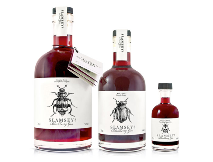
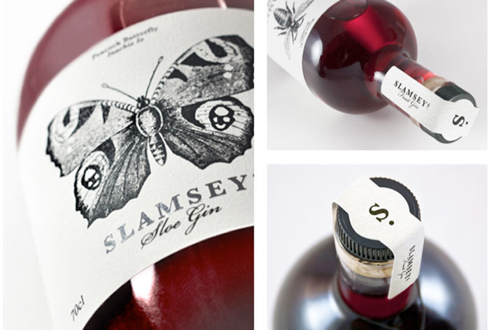
2. Slamseys Fruit Gin – designed by B & B Studio
This fruit gin for Slamseys caught our eye. The intricately illustrated insects also aim to echo this gins’ origins.
“Our packaging for Slamseys fruit gins is inspired by 17th century naturalist John Ray who was born near Slamseys farm. Our intricately illustrated insects echo the brand’s attention to detail and offer a modern take on the British countryside.” B & B Studio
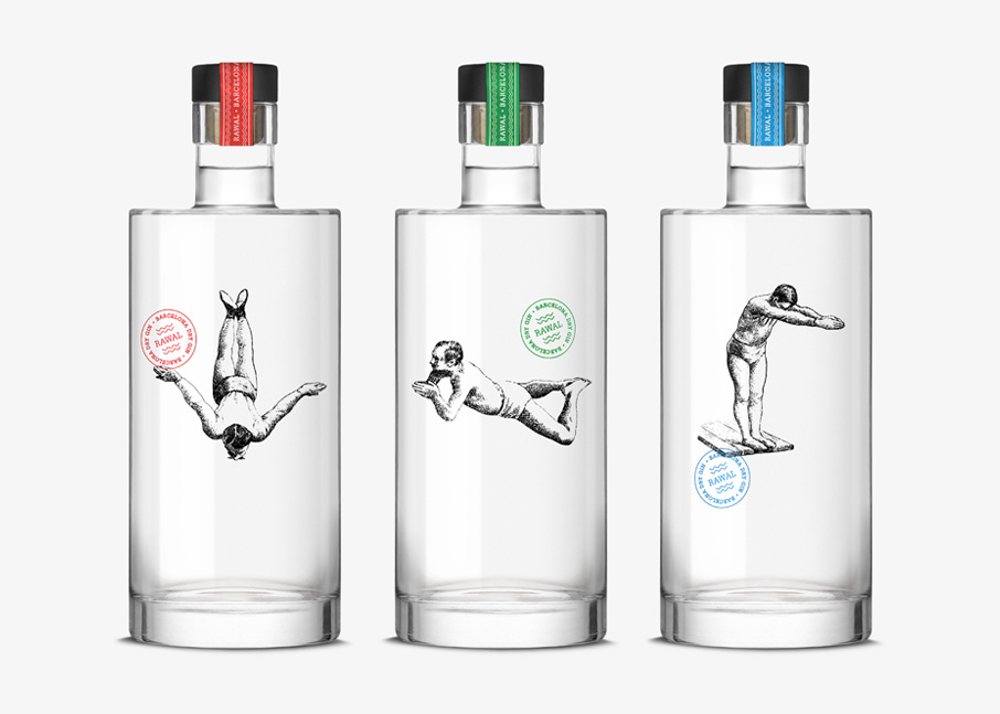
3. Gin Rawal designed by Studio Dorian
We love this simple, interactive and fun packaging design that Studio Dorian designed for its client Fishing Salada. Each bottle has an illustrated swimmer in a different pose. The idea being when the bottle is full the swimmer is perceived to be underwater and as you drink the gin and the levels decrease the divers are above the water.

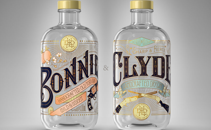
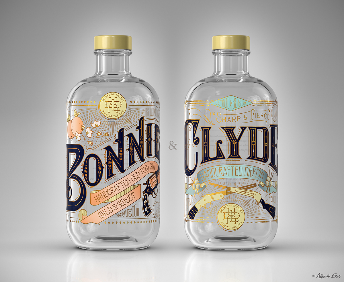
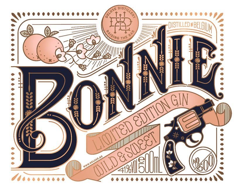
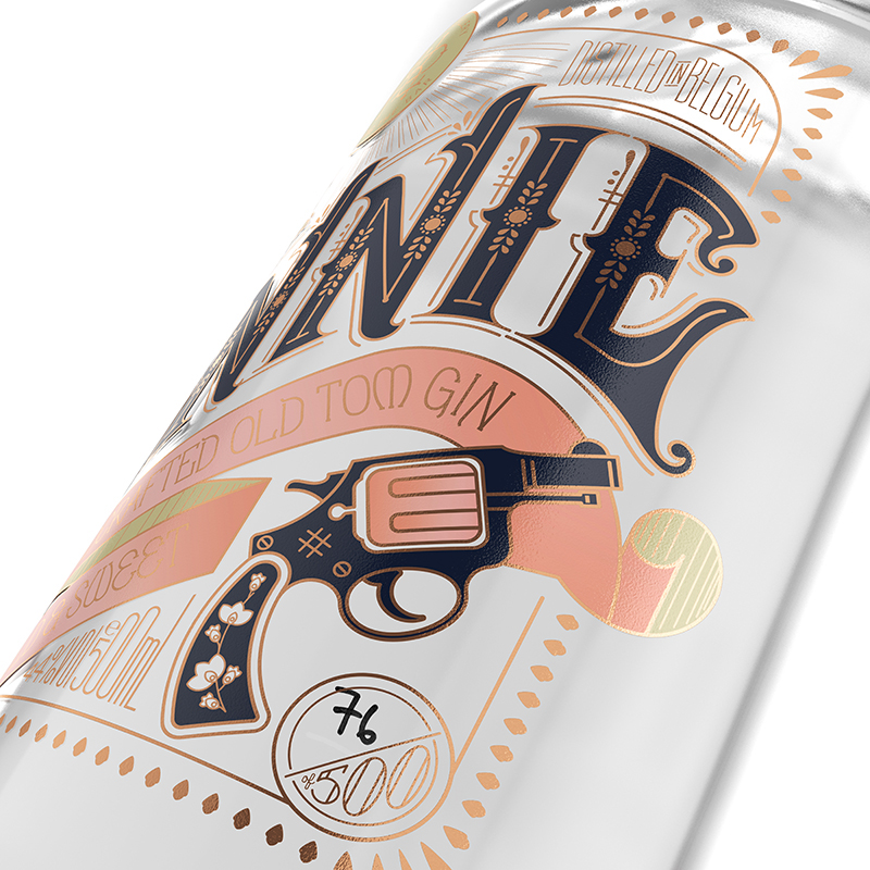
4. Bonnie & Clyde Gin designed by Pearly Yon
The pretty and intricate designs on these bottles of Gin designed by Pearly Yon unravel the story of the notorious criminals of the early 1900s, Bonny and Clyde. The good looking outlaws come to life in the packaging of these bottles, the sweeter tasting version is called Bonnie and the stronger tasting one is called Clyde. We love how the packaging unfolds the story of the two individuals but focuses on the aspects of their love story. The design of the two bottles is harmonious and the use of typography makes for two great bottles of gin!
“I enjoy the fact that I’ve created symbolic icons to represent aspects of the Bonnie and Clyde’s love story. Each icon has a specific meaning or reference to Bonnie and Clyde’s past. My biggest goal was to paint the story of Bonnie and Clyde in a romantic light. Their story is usually depicted as outlaws with guns but after a bit of digging into their past I found other aspects of their character to base their story on. I achieved this by showing their tale through tattoo inspired symbolism. The symbolic icons I created for Bonnie were softer and more feminine than the abrupt and possibly disturbing icons I created for Clyde”. Pearly Yon
5. Gillemore Magical Gin – Designed by Skinn Branding Agency
When Louis Gillemon a 19 years old, entrepreneur asked Skinn Branding Agency to develop a brand for a new premium gin they did not disappoint.
Experiencing the taste of magic is at the heart of the brand, the extraordinary packaging really does make this bottle magical. With its matt black finish and hypnotic logo this unique beaker shape bottle got our attention.
Hertog Jan, a 3 Michelin star restaurant in Bruges serves this premium gin in their own magical way!


